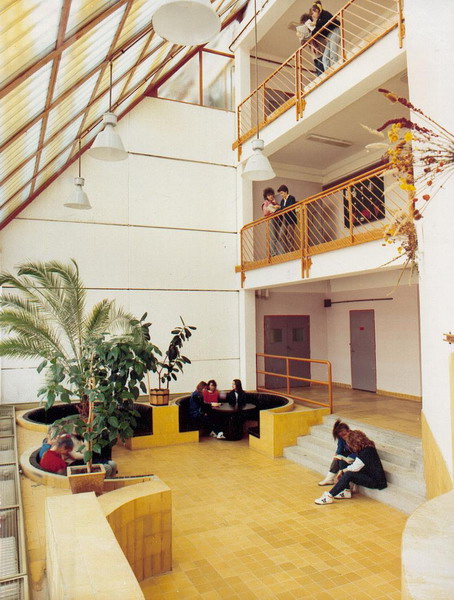
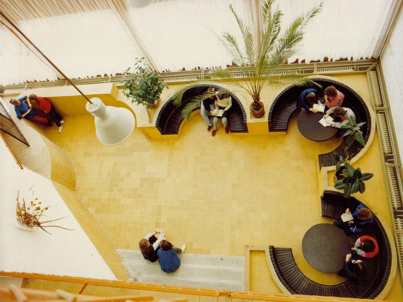
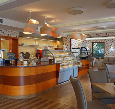
This project sparked first the thought in me that although we are organically connected and were raised on Scandinavian influence, we need to design with a different perspective, adapting our own direction here, in Hungary. Utilizing the idea of emphasizing/de-emphasizing in classical spaces, I used a variety of forms for different functions. The architect, Istvan Karolyi, envisioned flawless circular forms for seating in the cafeteria. This idea was complemented by the free-plasty counter as the other focal point of the space. In the high school, every item needs to be durable. For this reason, ceramic coverings were used for the interior section, while seating was created by seaming wooden segments to the wall; forming an effortless curve.

